Visualization tips#
Many correlations#
Exploratory visualization#
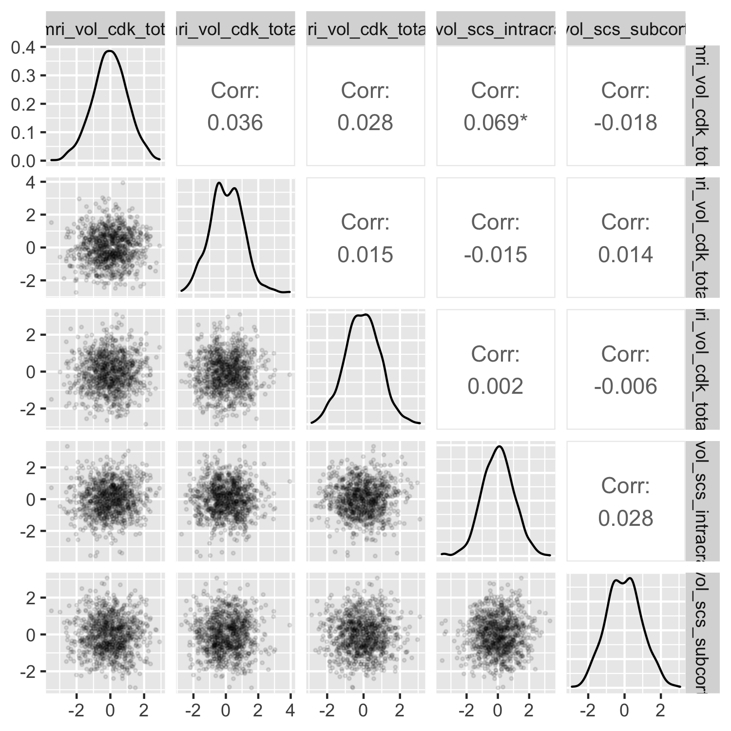
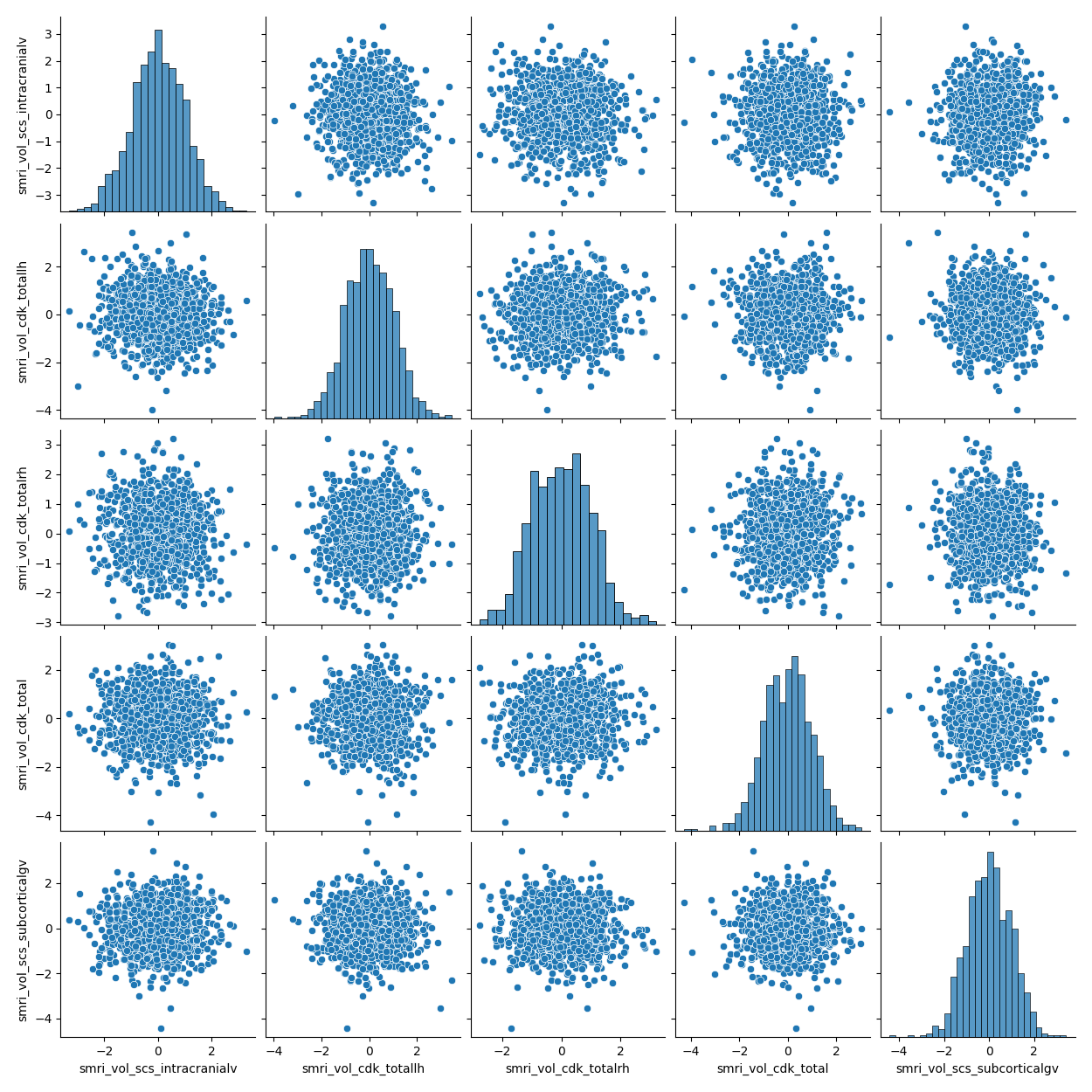
You may be exploring correlations between brain statistics, between behavioral/clinical correlates, or across brain and behavior. With each brain statistic being calculated across many different ROIs, and with many behavioral correlates, you can generate scatterplots in small multiples in order to see the range of correlations as efficiently as possible.
ggpairs() from the GGally package will produce a flexible scatterplot matrix for exploratory visual data analysis. The plot is a ggplot2 object under the hood, so you can modify theme() elements. However, GGally plot matrix objects don’t behave exactly like single ggplots, so the syntax for modifying other plot aesthetics is slightly different.
library(dplyr)
library(GGally)

data %>%
  # ggpairs() can drop columns from the scatterplot matrix, but not by name
  select(-src_subject_id) %>%
  ggpairs(lower = list(continuous = wrap("points", size = 0.5, alpha = 0.1)))
pairplot() from the seaborn package will produce a flexible scatterplot matrix for exploratory visual data analysis. The plot is a matplotlib object under the hood, and can be manipulated as such.
import pandas as pd
import seaborn as sns

sns.pairplot(data)
Visualization on the brain#
If you have already selected your behavioral/clinical correlate of interest, you may wish to show how it correlates with brain statistics across different ROIs. You can plot the brain-behavior correlation values as a statmap across the brain’s surface, if you have mappings to from your ROIs to surface visualizations.
The examples below are shown (unless otherwise indicated) for plotting ROI-wise statistics using the Gordon et al. (2016) resting-state functional connectivity parcellation.
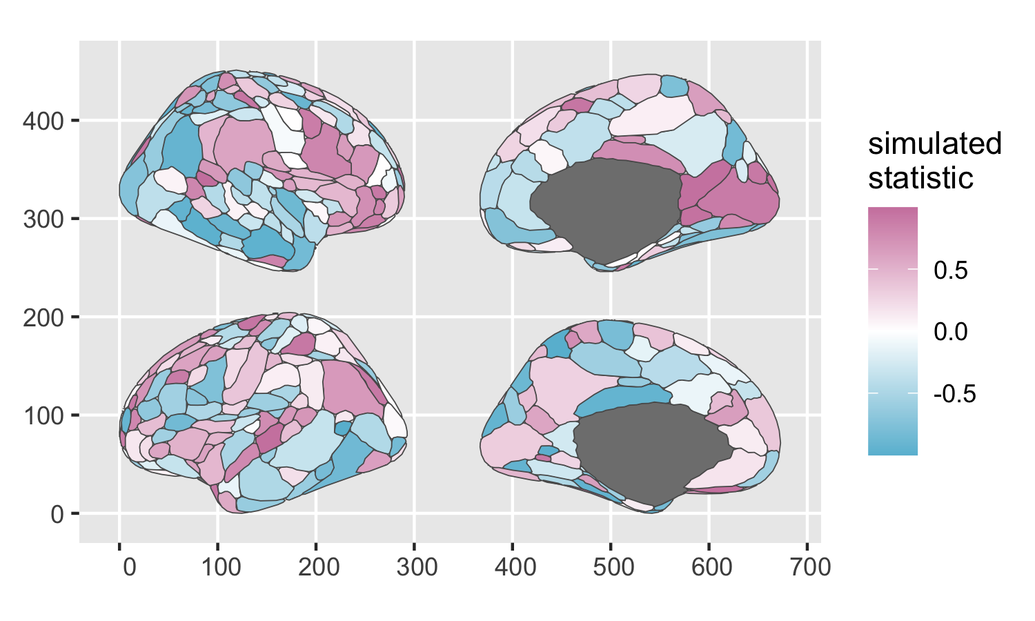
The ggseg R package uses ggplot2 under the hood to plot pre-rendered 2D shape-file brain atlases and color individual regions by statistics of interest. The base package only comes with a couple default FreeSurfer atlases, but the ggsegGordon helper package contains a compatible map of the Gordon parcellation.
Note that because ggseg <= 1.6.5 relies on static parcellation maps that were only rendered from lateral and medial views, you cannot easily render quick 2D views of, say, the ventral surface of the cortex.
ggseg is optimized for ROI-based visualization, not vertex- or voxel-wise. It stores its atlases as tibbles/dataframes with one row per region. You can join a dataframe of ROI-wise statistics onto the atlas dataframe, and then plot the augmented atlas dataframe with your statistic of interest mapped to aes(fill = my_statistic). You can bind on whatever ROI-wise statistics you have, as long as the parcel names in your data line up with the parcel names in the ggsegGordon atlas dataframe. If certain ROIs appear to be missing data when you plot, you may need to do some light string manipulation to harmonize any misaligned parcel names.
library(dplyr)
library(ggplot2)
library(ggseg)
library(ggsegGordon)

gordon %>%
  as_tibble() %>%
  left_join(roi_data, by = "annot") %>%
  ggplot() +
  geom_brain(atlas = gordon,
             mapping = aes(fill = statistic),
             position = position_brain(hemi ~ side)) +
  scale_fill_gradient2(low = "#68BCD6",
                       high = "#CE84AD") +
  labs(fill = "simulated\nstatistic")
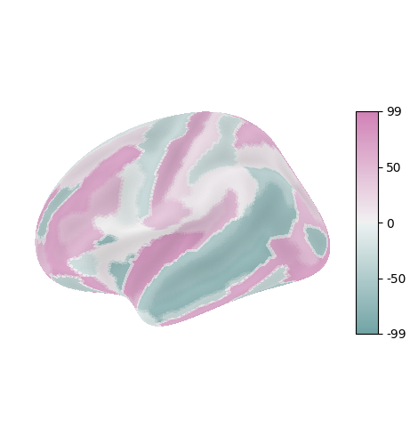
The nilearn.plotting library uses plotly and matplotlib under the hood to plot snapshots of 3D cortical surface visualizations. nilearn.datasets comes with a number of atlases; however, the Gordon atlas has not yet been implemented natively [1]. You can either import the atlas yourself as a numpy array of ROI codes (one per each surface vertex) or use an alternative atlas that has already been implemented. The example below plots simulated ROI-wise statistics for each parcel in the Destrieux surface atlas.
Because nilearn.plotting uses plotly under the hood to flexibly snapshot the underlying brain model each time a plot is called, it supports all six canonical hemisphere views: medial, lateral, dorsal, ventral, anterior, and posterior. However, it can only render one hemisphere/view at a time.
nilearn.plotting surface plots are optimized for vertex-wise visualization. nilearn stores atlases as 1D arrays with one row per vertex. Each row’s value is that ROI’s integer code, and all indices with the same code value thus belong to the same ROI. You can plot any array of stat values as long as the array has the same dimensions as the atlas. If you have a list or pandas dataframe column of one stat values for each atlas ROI label, you will need to iterate through the atlas array of vertices, fetching the relevant stat value for each vertex.
Once you have that, you can plot stat values on the surface! Use plot_surf_stat_map(), which will vary color with your statistic of interest if it’s fed into the stat_map argument. While it sounds like what you want, don’t use plot_surf_roi() for this because that function is designed for plotting arbitrary categorical colors to ROI definition atlases.
from nilearn import datasets, plotting, surface
import numpy as np
import pandas as pd
import random
from matplotlib import pyplot as plt
from seaborn import diverging_palette

# Retrieve destrieux parcellation in fsaverage5 space from nilearn
destrieux_atlas = datasets.fetch_atlas_surf_destrieux()

# The parcellation is already loaded into memory
parcellation = destrieux_atlas['map_left']

# Retrieve fsaverage5 surface dataset for the plotting background. It contains
# the surface template as pial and inflated version and a sulcal depth maps
# which is used for shading
fsaverage = datasets.fetch_surf_fsaverage()

# While it's not necessary to reformat atlas vertices as a dataframe, it's nice
destrieux_df_left = pd.DataFrame({'roi_val': destrieux_atlas.map_left})

destrieux_df_left['roi_label'] = [destrieux_atlas.labels[i] for i in destrieux_df_left['roi_val']]

# Simulated statistics for each atlas ROI
sim_stats = [random.uniform(-100, 100) for i in range(len(destrieux_atlas.labels))]

destrieux_df_left['sim_stat'] = [sim_stats[i] for i in destrieux_df_left['roi_val']]

plotting.plot_surf_stat_map(fsaverage['infl_left'],
                                stat_map=np.array(destrieux_df_left['sim_stat'], dtype = np.int32),
                                hemi='left', view='lateral',
                                # Use seaborn's helper function for diverging gradient colormap
                                cmap = diverging_palette(194, 327, s = 50, l = 64, as_cmap = True),
                                bg_map=fsaverage['sulc_left'], bg_on_data=True)
